Numerous websites now have many language options so their visitors from all over the world can comfortably browse. The internet has helped make the marketplace a global experience, so by having a website, you have opened the doors to your business to everyone with an internet connection. However, if they don’t understand the language, they won’t stay. Multi language website its easy.
Luckily, the process of turning your website multilingual is fairly simple. ConveyThis can create a translated version of your site in minutes and then you can customize the appearance and placement of you language switcher, make some layout changes to accomodate for wordier or Right To Left languages and change colors and images in those cases where the originals are unsuitable for the target culture.
The process is not fully automated, you’ll need to do some research beforehand. This guide explains some aspects of website design to help you comfortably step into the world of multilingual websites and great design.
Consistent branding
The user experience needs to be consistent regardless of the language version they are visiting. The look and feel should be very similar in all versions, some differences may be necessary due to language or culture diferences, but if you switch between languages you shouldn’t feel like you have been redirected to a completely different site.
Therefore, design elements like the layout and your business’s particular branding style should remain the same across all languages.
This is super easy to do in WordPress with ConveyThis, that perfectly identifies text regardless of the theme you have chosen (even if it’s customized!) and automatically translates it, even if you are working with other plugins.
This will help you have a global template with the same theme for all languages, and therefore, the same user experience.
The homepage of Airbnb works great as an example, let’s take a look at the Australian version:
And here is the Japanese version:
No doubt this is the same website. The background is the same and so is the search function. Having a unified design helps your brand identity, and saves time and effort when adding new languages or updating.
Clear language switchers
Pick a prominent location for the language switcher, like any of the four corners of your website, and place it on every page, not only the homepage. It has to be easy to find, no one ever wants to look for a hidden button.
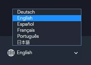
It is highly recommended that the language names are in their own language. “Español” instead of “Spanish” for example will work wonders. Asana does this, their site has a drop-down box with the language options available.

This way it helps visitors feel welcome. If your website is translated, then the language list should reflect that. Reading “German, French, Japanese” on an English website does not make navigation easier for people and it gives the impression that the English version is the most important one.
‘Languages’ is better than ‘Regions’
Many big international brands make you switch regions in order to be able to read the website in your language. This is a terrible idea that makes browsing harder for visitors. These websites are working with the assumption that you are browsing in the region where the language is spoken, so you get the text in your language but you may not get the content for the region you are interested in.
The following image was taken from the Adobe website:
Languages should not be inextricable from their regions. Take for example all those cosmopolitan cities like New York, London and Paris. Maybe a Belgian person living in the UK wants to buy from the UK site but browse in French. They have to choose between buying from the Belgian site in their language or buying from the UK site in English, and they want to do neither. You have thus accidentally created a barrier. Let’s take a look at a website that allows you to specify language and region separately, the Uber website.
This is excellent design. In this case, the language switching option has been placed in the footer on the left and instead of a dropdown box you have a modal due to the numerous options. The language names are also referred to in their own language.
As a bonus you could “remember” which was the user’s chosen language so from that first visit onwards they don’t have to switch anymore.
Auto-detect location
This feature is super useful so your visitors don’t access through the wrong language. And to save time on the user’s part so they don’t have to look for the language switcher. This is how it works: the website identifies the language the browser is in or their location.
But be careful in case the user is a tourist and not familiar with the local language because they will need the language button so they can do switch, for this reason, the tool is not always accurate.
When designing your multi language site don’t choose between autodetecting language and the language switcher, the latter is compulsory while the former is optional.
Flags are not suitable replacements for a language name
There are 21 Spanish speaking countries and 18 English speaking countries, and in China, there are 8 primary dialects, so flags are not great substitutes for language names. Additionally, flags may not be useful indicators because they might confuse those who don’t recognize them.
Be flexible with text space
This can be a challenge, but it is undeniable that translations don’t occupy the same space as the original text, some may be shorter, others may be longer, some may even need more vertical space!
Chinese characters contain lots of information so not much space is needed, while Italian and Greek are wordier and need twice as many lines. A good rule of thumb is to assume that some translations may require more than 30% extra space so be flexible with the layout and assign ample spaces for text. Those tight squeezes in the original website may not have enough space at all for the translation, English is a particularly compact language, and if you find the need to abbreviate in English so the content will fit, you’ll definitely encounter some trouble when it’s time to translate.
Besides having elbow room for text to stretch it’s also a good idea to have adaptive UI elements so buttons and input fields can also grow, you may also decrease the font size, but not too much.
The Flickr website is multilanguage, let’s take a look at the original “views” button:
It looks fantastic, everything is great, but ‘views’ turns out to be a longer word in other languages, requiring more space.
In Italian it requires three times as much space!
Many non Latin scripts, such as Arabic, require more height in order for the translation to fit. So to summarize, your website layout should be flexible enough to adapt to different language requirements so in the switch the polished look of the original doesn’t get lost.
Web font compatibility and website encoding
According to the W3C it’s highly recommended that you encode your webpage using UTF-8, which allows for special characters.
It’s pretty simple, the UTF declaration looks like this
Also make sure that the fonts are compatible with the different languages, otherwise the text may end up looking illegible. Basically, before deciding on any font, check its compatibility with all the scripts you need. If you want to enter the Russian market, check that the Cyrillic script is supported.
The following image was taken from Google Fonts and, as you can see, you can choose to download whichever scripts versions you need. Those languages with larger amounts of characters make for larger font files, so take that into account when picking and mixing fonts.
Regarding Right To Left languages
As the Middle Eastern market grows, you may consider creating a version of your website that attracts visitors from this region, this means adapting the layout so it’s compatible with their language. A characteristic feature of most Middle Eastern languages is that they are read from right to left! This is a big challenge and the solution starts with mirroring the interface.
This is Facebook’s design for left to right languages, such as English.
And this is the flipped design for right to left languages, such as Arabic.
Look closely, the placement of everything in the design has been mirrored.
Check out Robert Dodis’ article on design for Right to Left languages for further information on how to do this.
Some Right To Left languages are Arabic, Hebrew, Persian and Urdu and ConveyThis has no trouble adapting your website to accommodate for their language requirements and ensure a great user experience. And the best thing is you can customize the look of each language and make changes to the type of font or its size, and if necessary, edit the line height.
Choose appropriate icons and images
Visuals have a very heavy cultural component and are key elements of proper website design. Each culture assigns meaning to different images and icons, some interpretations are positive and some the complete opposite. Some images reflect the experiences of ideals of one culture but in a different context it will make the users feel alienated.
Here is an example of an image that had to be replaced because it wasn’t culturally appropriate. Please note, not all images will be offensive to others, maybe it will just generate apathy when you want people to be curious and interested in your product.
This is the Clarin’s homepage for the French language, featuring a Caucasian woman. And here is the Korean version, with a Korean woman as the brand’s ambassador.
The kind of visuals that may offend are those that may seem innocent to some cultures, but, in the eyes of a different culture, they are displaying behaviours that are illegal or taboo, for example, depictions of homosexuality or female empowerment.
This also applies to icons, while in the US an icon with two champagne glasses toasting represents celebration, in Saudi Arabia it’s illegal to drink alcohol so that icon will have to be replaced with a culturally appropriate one.
Therefore research will be required to ensure that the icons you have chosen are appropriate for the target market. If you are not sure you can always play it safe.
For example, these three icons featuring the Earth, the first one was designed for Australian audiences; the second one, for African audiences; and the last one is suitable for larger and global audiences as no particular area is featured.
Last but not least, ConveyThis can translate any text, as long as it is not embedded in an image. The software will not be able to identify what it’s written on it so it will remain in the original language, so avoid embedding text.
Choice of colors
As mentioned in the previous section, cultures interpret images differently and the same thing happens with colors. Their meanings are subjective.
For instance, in some cultures, white is the color of innocence, but others would disagree, it is the color of death. The same happens with red, in Asian cultures it is used in celebrations but for some African countries it doesn’t have such a positive connotation as it is linked to violence.
However, it seems that blue is the safest of all colors, commonly associated with positive meanings like calm and peace. Many banks use blue in their logos because it can also mean trust and security.
This article shows the differences in color meanings all over the world, very useful for starting your research on what are the best colors for your multilingual site.
Format adjustments
Consider avoiding using only numbers when writing dates because there are many different ways to write them, in the US the official format is mm/dd/yyyy and if you can only see the numbers some users from other countries which use different systems (such as dd/mm/yyyy) may get confused. So your options are: making sure that the translated versions have the date format adapted or write the month in letters so that ConveyThis will always write the correct date.
Moreover, while in the US the imperial system is used, most countries use the metric system, so you will need to decide if it would be suitable for your site to have the measurements transformed.
The best translation plugin for WordPress
There are so many options when it comes to adding a translation plugin to your WordPress website and not all of them work in the same way, results will vary. With ConveyThis you are guaranteed a perfect integration no matter your website design.
ConveyThis is the best choice for website translation with 92 languages available. It’s a reliable WordPress plugin that will allow you to have a solid multi language version of your website fast. It can understand the site’s layout, detect all text and translate it. ConveyThis also includes an intuitive editor for text customization.
ConveyThis includes a one-size-fits-all language switcher button that works with any site as default, but you can also edit it as much as you like. We also follow the design principles stated in this article:
- Consistent branding on all language versions of the website.
- Clear language switcher and the option to choose a preferred language.
- Websites are encoded with UTF-8 automatically.
- Proper interfaces for Right To Left languages
ConveyThis: a multilanguage website solution you can trust
It is commonly believed that website translation is a complex process. But there is no need to postpone it because you don’t want to deal with the headaches. It’s not daunting at all! With ConveyThis, it becomes a straightforward conversion. It is seamless and fast.
After a quick installation all your content can now be translated without affecting the formatting, and that includes content generated by other apps and the checkout process. ConveyThis is an easy tool for multi language website translation that won’t make a mess of your code, like others do.
The option to order professional translations of your site is also available! They will help you completely transform your multi language website into a multi cultural one, drastically improving your clients’ experience. Remember that if you translate a website, you must also have customer support available in your new client’s language. Consider investing in content localization and adaptation to guarantee a superb user experience for your visitors.


The End in Sight for Google-Translate for Websites! – ConveyThis
December 8, 2019[…] the computer-related-text in the Swedish language. Elements like these helped the design-team formulate a path for clients visiting the platform, to an easy translation experience and avoiding the drop-scroll index as previously […]
Global Search Engine Optimization for All Language Platforms – ConveyThis
December 10, 2019[…] the ideas around the multilingual platform and client-base be formulated, the following would be a look at the textual-ingredient to language […]
Turn your WooCommerce Multilingual – ConveyThis
March 19, 2020[…] and get a linguist from the ConveyThis team to take a look and edit it so you can be sure that the wording and tone are suitable to your store values and […]
How Customizable is WooCommerce? – ConveyThis
March 23, 2020[…] that visuals are always very loaded with cultural meaning, and different audiences have different expectations of how stores should display their […]