;fill-opacity:1;'%20d='M%2019.511719%2039.964844%20C%208.304688%2039.964844%200%2031.289062%200%2020.324219%20L%200%2020.230469%20C%200%209.363281%208.160156%200.46875%2019.847656%200.46875%20C%2027.023438%200.46875%2031.320312%202.878906%2034.847656%206.375%20L%2029.519531%2012.492188%20C%2026.59375%209.820312%2023.59375%208.179688%2019.800781%208.179688%20C%2013.390625%208.179688%208.761719%2013.53125%208.761719%2020.085938%20L%208.761719%2020.203125%20C%208.761719%2026.757812%2013.273438%2032.203125%2019.800781%2032.203125%20C%2024.144531%2032.203125%2026.808594%2030.46875%2029.808594%2027.722656%20L%2035.136719%2033.121094%20C%2031.199219%2037.335938%2026.855469%2039.964844%2019.511719%2039.964844%20'/%3e%3cpath%20style='%20stroke:none;fill-rule:nonzero;fill:rgb(26.274511%25,42.352942%25,94.901961%25);fill-opacity:1;'%20d='M%2035.878906%200.0351562%20L%2044.136719%200.0351562%20L%2044.136719%2039.867188%20L%2035.878906%2039.867188%20Z%20M%2035.878906%200.0351562%20'/%3e%3cpath%20style='%20stroke:none;fill-rule:nonzero;fill:rgb(26.274511%25,42.352942%25,94.901961%25);fill-opacity:1;'%20d='M%2059.472656%2016.15625%20C%2056.039062%2016.15625%2053.808594%2018.613281%2053.160156%2022.375%20L%2065.617188%2022.375%20C%2065.113281%2018.664062%2062.953125%2016.15625%2059.472656%2016.15625%20M%2073.535156%2027.578125%20L%2053.28125%2027.578125%20C%2054.097656%2031.335938%2056.710938%2033.3125%2060.40625%2033.3125%20C%2063.191406%2033.3125%2065.183594%2032.445312%2067.464844%2030.300781%20L%2072.191406%2034.492188%20C%2069.480469%2037.867188%2065.566406%2039.941406%2060.289062%2039.941406%20C%2051.527344%2039.941406%2045.070312%2033.769531%2045.070312%2024.832031%20L%2045.070312%2024.710938%20C%2045.070312%2016.347656%2051%209.480469%2059.472656%209.480469%20C%2069.191406%209.480469%2073.65625%2017.074219%2073.65625%2025.363281%20L%2073.65625%2025.457031%20C%2073.65625%2026.300781%2073.609375%2026.808594%2073.535156%2027.578125%20'/%3e%3cpath%20style='%20stroke:none;fill-rule:nonzero;fill:rgb(26.274511%25,42.352942%25,94.901961%25);fill-opacity:1;'%20d='M%2089.375%2039.796875%20L%2081.863281%2039.796875%20L%2070.390625%2010.324219%20L%2079.152344%2010.324219%20L%2085.679688%2029.914062%20L%2092.257812%2010.324219%20L%20100.847656%2010.324219%20Z%20M%2089.375%2039.796875%20'/%3e%3cpath%20style='%20stroke:none;fill-rule:nonzero;fill:rgb(26.274511%25,42.352942%25,94.901961%25);fill-opacity:1;'%20d='M%20111.550781%2016.15625%20C%20108.121094%2016.15625%20105.886719%2018.613281%20105.238281%2022.375%20L%20117.695312%2022.375%20C%20117.191406%2018.664062%20115.03125%2016.15625%20111.550781%2016.15625%20M%20125.617188%2027.578125%20L%20105.359375%2027.578125%20C%20106.175781%2031.335938%20108.792969%2033.3125%20112.488281%2033.3125%20C%20115.246094%2033.3125%20117.265625%2032.445312%20119.542969%2030.300781%20L%20124.273438%2034.492188%20C%20121.558594%2037.867188%20117.648438%2039.941406%20112.367188%2039.941406%20C%20103.609375%2039.941406%2097.152344%2033.769531%2097.152344%2024.832031%20L%2097.152344%2024.710938%20C%2097.152344%2016.347656%20103.078125%209.480469%20111.550781%209.480469%20C%20121.273438%209.480469%20125.734375%2017.074219%20125.734375%2025.363281%20L%20125.734375%2025.457031%20C%20125.734375%2026.300781%20125.6875%2026.808594%20125.617188%2027.578125%20'/%3e%3cpath%20style='%20stroke:none;fill-rule:nonzero;fill:rgb(26.274511%25,42.352942%25,94.901961%25);fill-opacity:1;'%20d='M%20143.566406%2018.757812%20C%20138.070312%2018.757812%20134.710938%2022.085938%20134.710938%2029.074219%20L%20134.710938%2039.867188%20L%20126.457031%2039.867188%20L%20126.457031%2010.613281%20L%20134.710938%2010.613281%20L%20134.710938%2016.519531%20C%20136.390625%2012.46875%20139.128906%209.867188%20144%2010.085938%20L%20144%2018.757812%20Z%20M%20143.566406%2018.757812%20'/%3e%3c/g%3e%3c/svg%3e)
;fill-opacity:1;'%20d='M%20144.558594%2039.894531%20L%20155.4375%209.839844%20C%20155.4375%209.839844%20147.28125%209.839844%20139.121094%2011.515625%20L%20128.867188%2039.894531%20Z%20M%20142.675781%201.78125%20L%20140.585938%207.539062%20C%20148.738281%205.863281%20156.902344%205.863281%20156.902344%205.863281%20L%20158.992188%200.105469%20C%20158.992188%200.105469%20150.832031%200.105469%20142.675781%201.78125%20M%2085.980469%2032.773438%20C%2090.898438%2033.71875%2095.914062%2034.136719%20101.039062%2034.136719%20C%20106.375%2034.136719%20110.140625%2032.984375%20110.554688%2029.320312%20C%20110.765625%2027.640625%20109.089844%2026.382812%20106.167969%2024.707031%20C%20102.816406%2022.824219%2099.894531%2021.878906%2096.960938%2019.886719%20C%2094.03125%2017.898438%2092.78125%2014.859375%2093.71875%2011.507812%20C%2094.871094%207.636719%2097.585938%205.4375%20101.664062%203.34375%20C%20106.480469%200.9375%20110.242188%20-0.0078125%20119.550781%20-0.0078125%20C%20125.40625%20-0.0078125%20131.054688%200.515625%20136.597656%201.667969%20L%20134.609375%207.113281%20C%20129.691406%206.167969%20124.675781%205.75%20119.550781%205.75%20C%20114.214844%205.75%20110.453125%206.90625%20110.035156%2010.570312%20C%20109.828125%2012.246094%20111.5%2013.503906%20114.425781%2015.179688%20C%20117.773438%2017.066406%20120.695312%2018.011719%20123.628906%2020%20C%20126.558594%2021.988281%20127.808594%2025.027344%20126.871094%2028.378906%20C%20125.71875%2032.253906%20123.003906%2034.449219%20118.925781%2036.542969%20C%20114.113281%2038.949219%20110.347656%2039.894531%20101.039062%2039.894531%20C%2095.183594%2039.894531%2089.535156%2039.375%2083.992188%2038.21875%20Z%20M%2062.34375%2039.894531%20L%2071.441406%2014.867188%20C%2074.476562%206.488281%2063.390625%209.527344%2060.875%2011.515625%20C%2058.890625%2012.984375%2055.332031%2016.441406%2054.078125%2020.105469%20L%2046.859375%2040%20L%2031.175781%2040%20L%2040.273438%2014.867188%20C%2043.308594%206.488281%2032.222656%209.527344%2029.710938%2011.515625%20C%2027.722656%2012.984375%2024.167969%2016.441406%2022.910156%2020.105469%20L%2015.691406%2040%20L%200.0078125%2040%20L%2014.441406%200.105469%20C%2019.464844%200.105469%2022.179688%201.257812%2024.375%203.457031%20C%2025.207031%204.289062%2025.734375%205.339844%2026.046875%206.496094%20C%2028.980469%204.714844%2031.589844%203.351562%2033.371094%202.726562%20C%2036.613281%201.46875%2040.691406%200.105469%2045.714844%200.105469%20C%2050.734375%200.105469%2053.453125%201.257812%2055.644531%203.457031%20C%2056.480469%204.289062%2057.007812%205.339844%2057.320312%206.496094%20C%2060.25%204.714844%2062.863281%203.351562%2064.640625%202.726562%20C%2067.886719%201.46875%2071.964844%200.113281%2076.984375%200.113281%20C%2082.007812%200.113281%2084.722656%201.265625%2086.917969%203.464844%20C%2089.21875%205.660156%2089.113281%209.742188%2088.28125%2012.050781%20L%2078.027344%2039.902344%20L%2062.34375%2039.902344%20Z%20M%2062.34375%2039.894531%20'/%3e%3c/g%3e%3c/svg%3e)
;fill-opacity:1;'%20d='M%202.453125%209.882812%20L%202.453125%2012.851562%20L%207.304688%2012.851562%20L%2016.800781%2030.734375%20L%2028.488281%2030.734375%20L%2037.980469%2012.824219%20L%2042.832031%2012.792969%20L%2042.84375%209.882812%20L%2028.328125%209.882812%20L%2028.328125%2012.804688%20L%2032.195312%2012.804688%20L%2025.488281%2025.515625%20L%2018.234375%2012.847656%20L%2023.527344%2012.824219%20L%2023.515625%209.882812%20Z%20M%2096.097656%209.882812%20L%2096.097656%2012.851562%20L%20100.949219%2012.851562%20L%20110.445312%2030.734375%20L%20122.128906%2030.734375%20L%20131.625%2012.824219%20L%20136.476562%2012.792969%20L%20136.484375%209.882812%20L%20121.972656%209.882812%20L%20121.972656%2012.804688%20L%20125.835938%2012.804688%20L%20119.132812%2025.515625%20L%20111.878906%2012.847656%20L%20117.167969%2012.824219%20L%20117.160156%209.882812%20Z%20M%2072.222656%209.882812%20L%2072.222656%2012.851562%20L%2077.078125%2012.851562%20L%2077.082031%2027.453125%20L%2071.96875%2027.453125%20L%2071.96875%2030.707031%20L%2077.085938%2030.734375%20L%20101.3125%2030.734375%20L%20101.3125%2021.027344%20L%2098.15625%2021.027344%20C%2097.984375%2026.167969%2093.542969%2027.457031%2091.675781%2027.457031%20C%2089.960938%2027.457031%2086.640625%2027.453125%2086.640625%2027.453125%20L%2086.640625%2012.847656%20L%2091.417969%2012.824219%20L%2091.410156%209.882812%20Z%20M%2055.890625%209.285156%20C%2047.644531%209.285156%2040.960938%2014.214844%2040.960938%2020.292969%20C%2040.960938%2026.375%2047.644531%2031.304688%2055.890625%2031.304688%20C%2064.136719%2031.304688%2070.824219%2026.375%2070.824219%2020.292969%20C%2070.824219%2014.214844%2064.136719%209.285156%2055.890625%209.285156%20Z%20M%2055.675781%2028.0625%20C%2052.769531%2028.0625%2050.414062%2024.566406%2050.414062%2020.25%20C%2050.414062%2015.933594%2052.769531%2012.4375%2055.675781%2012.4375%20C%2058.582031%2012.4375%2060.941406%2015.933594%2060.941406%2020.25%20C%2060.941406%2024.566406%2058.582031%2028.0625%2055.675781%2028.0625%20Z%20M%20149.539062%208.921875%20C%20141.289062%208.921875%20134.605469%2013.933594%20134.605469%2020.113281%20C%20134.605469%2026.292969%20141.289062%2031.300781%20149.539062%2031.300781%20C%20157.78125%2031.300781%20164.46875%2026.292969%20164.46875%2020.113281%20C%20164.46875%2013.933594%20157.78125%208.921875%20149.539062%208.921875%20Z%20M%20149.324219%2028.007812%20C%20146.417969%2028.007812%20144.0625%2024.453125%20144.0625%2020.066406%20C%20144.0625%2015.679688%20146.417969%2012.125%20149.324219%2012.125%20C%20152.230469%2012.125%20154.585938%2015.679688%20154.585938%2020.066406%20C%20154.585938%2024.453125%20152.230469%2028.007812%20149.324219%2028.007812%20Z%20M%20149.324219%2028.007812%20'/%3e%3c/g%3e%3c/svg%3e)


Creating or designing a website isn’t as simple as selecting the most visually appealing template from a range of options. While the aesthetics—such as the look and feel of the site—are undoubtedly crucial elements, they aren’t the only factors to consider when making design decisions. A website’s overall design and functionality directly impact user experience (UX), which plays a significant role in influencing your visitors’ opinions of your site and their likelihood of taking desired actions, such as making a purchase.
It’s clear: the success of your website is closely tied to its layout and how users interact with it. A smooth, intuitive navigation experience fosters positive feelings, encouraging users to engage longer and more meaningfully with your content. On the contrary, a poor user experience can drive visitors away, often irreversibly. This is why the choice of layout is one of the most important decisions in website and user experience design.
Indeed, it’s not just about aesthetics—it’s about creating a seamless, engaging experience. A report from the Society of Digital Agencies (SoDA) highlights that poor website UX is detrimental to businesses, proving that layout and design choices are crucial for maintaining user interest and driving conversions.
In today’s digital age, trends in design evolve rapidly, with certain features becoming staples. For example, full-bleed images and three-column layouts are currently trending in the design world, as they help present content in an engaging and visually balanced way. These trends often work well because they align with user expectations and patterns, fostering familiarity and comfort.
However, this doesn’t mean you should blindly follow trends. Both the classic, familiar designs and more unique, attention-grabbing approaches have their advantages and drawbacks. Your choice should depend on your target audience and what you believe will resonate best with them. Do you opt for the comfort of familiar design elements, or do you take a bold step to stand out and attract attention to your business?
Layout Ideas for Your Multilingual Website can help you take these considerations to the next level when designing a multilingual experience. It requires balancing design elements, user accessibility, and cultural nuances to ensure a seamless and effective user experience.
The Characteristics of a Great Website:
Designing a great website means considering many different aspects. The beauty of web design is that it offers endless possibilities for customization and improvement, depending on the needs of your business and the preferences of your target audience. Ultimately, these decisions will form and reflect your brand image. A well-designed website not only attracts visitors but also keeps them engaged, guiding them toward desired actions such as purchases or sign-ups.
Studies from Adobe reveal that two-thirds of people would rather read well-designed content than something plain when pressed for time, and 38% of visitors will leave a website if it’s unattractive. These statistics highlight how critical good design is for keeping visitors on your site and engaged. UX (user experience) and UI (user interface) design are constantly evolving, and experts recommend focusing on elements that elevate user interaction, providing a functional and visually appealing experience.
Here are some essential elements for creating a great website design:
- Clutter-Free Layout: A clean, organized design is vital. Keep the layout free from unnecessary elements, and use ample white space between sections. This reduces visual clutter, making it easier for visitors to focus on your content. Showcase what matters most to your users and remove anything that doesn’t serve a purpose.
- Simple Navigation: Users should be able to navigate your website intuitively. Ensure the site structure is clear and straightforward, with simple paths from one section to another. Minimize the steps required to reach important content, as complex navigation can lead to frustration and site abandonment.
- Visual Hierarchy: Organizing content by importance helps guide visitors’ attention. Use large, bold headings, contrasting colors, and prominent graphics for key messages. The most important elements should stand out to lead users through the site, allowing them to easily find what they are looking for.
- Color Palette and Imagery: Choose a color scheme that enhances the user experience. Bright, contrasting colors work well to highlight calls to action, while a thoughtfully selected imagery reinforces your message and engages users. Ensure images are high-quality and relevant to your content, offering a more immersive experience for visitors.
- Mobile-Friendly Design: Given the increasing use of mobile devices, your website must be mobile-optimized. Mobile-first indexing is the default for all new web domains since July 2019, making it crucial to ensure that your website is functional and visually appealing on mobile screens as well as desktop versions.
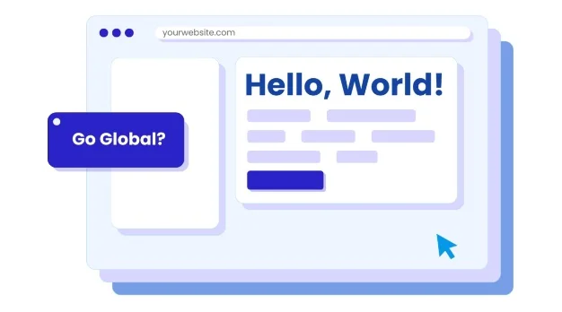
- Language Switching: With the growing global marketplace, offering a multilingual website is essential. A language switcher allows visitors from different regions to access your content in their preferred language. This not only improves accessibility but also enhances user engagement, helping your website reach a wider audience and providing a more personalized experience across borders.
By focusing on these characteristics, you can create a website that is not only beautiful but also user-friendly and functional, ultimately leading to a positive experience that encourages engagement and conversion.
What do Multilanguage Websites Look Like?
Creating a multilingual website doesn’t have to be a complex or intimidating task. With tools like ConveyThis, adding a simple language button to the corner of your site makes it easy for international users to switch between languages. This feature enhances the overall user experience and opens your business to global opportunities, especially in today’s interconnected world.
Let’s take a look at some examples of great websites that incorporate these design principles effectively:
1. Crabtree & Evelyn

Let’s start with Crabtree & Evelyn, a body and fragrance enterprise that started in Germany but has taken its business global with a great layout and language options.
Since the variety of products is so wide, they have chosen not to overwhelm their visitors by taking care of their layout and making careful design decisions, like filling the screen of their homepage first with a simple message, in this case, about the holiday season, and when you scroll down or click on the “Shop Now” button, the visitor is led to the products.
It’s a really sophisticated and clean look, visitors will definitely stay longer, captivated by the experience. Regarding the menu, there are two options for searching, a search button where you can type a keyword, if you have narrowed down what you are looking for; or click the shop button, and then choose where or how you want to explore, by category, by collection, or check out the gift sets.
And now to the most amazing thing ever, the language switcher. You can find it at the bottom of the page, and when you click it, it shows you the current store settings, with drop down menus with alternatives.
And this is something we’ve talked about previously on the article on types of language buttons, it’s fantastic that they have two options, one for area and the other for language, because we know that not everyone is browsing in their language or in their country. This website is the perfect example of a well done localization job. Contact the ConveyThis team to find out more information on how you can make your website more welcoming to users all over the world!
2. Digital Menta
First of all, stunning work. Great decisions all over the place, don’t you think? And fantastic use of color for establishing contrast and focus areas. Let’s list all the good things about this site: negative space, different sized fonts, custom artwork, color and tint.
The arrangement of the different sized elements shows you where to start reading and the white space gives the reader time to pause.
Here we have a clear example of visual hierarchy:
From least to most important: the business partners in lighter tints, “Make it happen” in a small font, “let’s talk” button with black background and white letters, “Evolutionary digital” in a large and bolded font, and “marketing” in the same font as before but highlighted with green.
Additionally, the imperatives “Make it happen” and “Let’s talk” also aid the visitor in their browsing experience.
The navigation bar is as simple and clear as Crabtree & Evelyn’s, and the social media bar at the right is a great choice for businesses that rely heavily on social media as a tool.
You can find their language buttons at the bottom of the page, they are small, but all the options are visible and their colors are bright and very different to the Digital Menta color palette so they can be easily found.
3. Yogang

Here we have an adorable example of decluttered websites. There is a lot of negative space and the color figures are animated, this instills a feeling of curiosity in visitors! Casual browsers will definitely stay and take a look at the rest of the website and learn more about Yogang. Brilliant design.
Yogang is a fun game for children that combines physical activity, relaxation, sharing and creativity, and their homepage reflects that. The animation of the different characters doing yoga poses is not about showing off programing skills, it’s a reflection of the spirit of the product.
Simultaneously adorable and a call to action to make Yogang part of your children’s childhood. They appeal to the impulse buyers with a “Buy” button and also help a potential customer learn more about the product first by guiding them to the tutorials.
Their longer menu bar is justified in that they sell B2B and B2C, so they have different kind of visitors looking for different things and they all have to find what their are looking for fast.
Their language button is an unobtrusive button with the options “EN” and “FR”. They have narrow language options but they clearly identified their largest markets and have focused heavily on providing the best experience possible for the user.
4. Navy or Grey
Lots of custom artwork in this list, we know. It’s such a versatile element and these websites use them so well to create a specific look and feel.
Navy and Grey is the last example on this list, it also has the features that we have praised before, did you identify them, too? It makes for a very sophisticated experience, it’s captivating. It makes me feel calm, seeing all that negative space, I’m not overwhelmed at all by the idea of browsing this website and the clear menu bar assures me that I’ll find what I’m looking for without any struggle.
I appreciate how they have separated “Shirts” and “Suits” in the menu, it’s a suitable decision for a tailoring business, many other stores would have created subpages for these products, and that’s also a reasonable decision, but for Navy or Grey, it contributes to that polished look.
This website in particular, has put their language button at the top right, and the font they have chosen is the same as the rest of the website. And at the bottom left, they have added a Whatsapp button for quick contact.
Layout Ideas for Your Multilingual Website:
Designing a multilingual website requires more than just translating content—it involves thoughtful layout decisions to ensure that the user experience remains seamless, intuitive, and culturally sensitive across different languages. Here are some key layout ideas to consider when building your multilingual site:
1. Language Switcher Placement
The placement of the language switcher is crucial for ensuring users can easily navigate between different language options. It should be easily visible but not disruptive to the overall design. Common placements include:
- Top-right corner: This is the most common position, as users are accustomed to finding it here.
- Footer: If you have a more minimalistic design, placing the switcher in the footer can keep it out of the way while still easily accessible.
- Navigation Bar: You can incorporate a language switcher in your website’s main navigation bar, either as a dropdown or a separate menu item.
Make sure the language button is distinct, using flags, abbreviations (like “EN” for English or “FR” for French), or full language names for clarity.
2. Simple Navigation
Clear, straightforward navigation is essential for users across different linguistic backgrounds. An intuitive layout minimizes confusion and helps visitors find what they need quickly:
- Horizontal Navigation Bar: For most websites, a horizontal navigation bar works well, especially for language options with short labels. The layout should adjust based on text length in different languages.
- Dropdown Menus: Dropdown menus are ideal for showing multiple options, such as language, region, or product categories. Ensure these menus are easy to navigate and don’t get too crowded.
- Breadcrumbs: Breadcrumb navigation can be especially useful in complex multilingual websites. They show users their path and allow them to quickly jump back to previous sections.
The goal is to keep the navigation simple and intuitive, with clear calls to action.
3. Responsive Design
A responsive layout ensures that your website provides a good user experience across various devices, including desktops, tablets, and smartphones. This is especially important for multilingual websites because:
- Different languages might require more or less space, leading to different text lengths that affect the layout.
- Mobile users make up a large portion of the global internet population, so it’s important to design your site for easy navigation on smaller screens.
Ensure that your language switcher and navigation menus remain accessible and functional on all devices. Use flexible grid systems and media queries to adapt the design as needed.
4. Consistent Visual Hierarchy
Visual hierarchy helps users naturally navigate your site by guiding their attention to important elements first. The key to a successful multilingual layout is maintaining this hierarchy across all languages:
- Prioritize key elements: Use size, color, and placement to make sure important elements stand out, such as calls to action, buttons, or key information like pricing and offers.
- Typography and spacing: Larger, bold fonts for headings, subheadings, and other key text will naturally draw the user’s eye. Ensure enough spacing between elements to avoid clutter, especially on mobile screens where space is limited.
- Content flow: For languages that read from right to left (like Arabic or Hebrew), make sure the content flow adjusts accordingly. This may involve mirroring the layout to accommodate these language conventions.
A consistent visual hierarchy helps all users, regardless of language, easily find and focus on what matters most on your site.
5. Cultural Sensitivity
When building a multilingual website, it’s essential to consider cultural differences, as they can impact the perception of your brand. Factors to think about include:
- Color schemes: Colors can have different meanings in various cultures. For example, red might signify luck in Chinese culture but danger in Western countries. Ensure that the color palette you choose is neutral or culturally appropriate for all regions.
- Imagery: Some images or symbols may be meaningful or offensive depending on the culture. Ensure that your images and icons are relevant and respectful to different cultural groups.
- Content localization: Beyond translating text, consider localizing content to fit cultural contexts. This might include adjusting copy to match local preferences, holiday messaging, or product availability.
Making these adjustments ensures that your website is welcoming and appropriate for global audiences.
6. Easy-to-Read Typography
Typography plays a crucial role in web design, especially when supporting multiple languages. Different languages may have unique characters, so it’s important to select fonts that can handle these differences without losing readability:
- Legibility: Choose clean, simple fonts that are easy to read, particularly for body text. Avoid overly decorative fonts that may be difficult to read in some languages.
- Font support for different languages: Ensure the fonts you use support characters like accented letters, Cyrillic, or Asian characters. Many web fonts, such as Google Fonts, offer multilingual support.
- Consistent style: Keep font styles consistent across languages to maintain a cohesive look and feel on the site. If one language requires a different font, ensure that it still aligns with the overall brand aesthetics.
Typography choices should prioritize readability while reflecting your brand’s tone and values, no matter the language.
7. Multilingual SEO Considerations
Search engine optimization (SEO) is an important aspect of any website, and this extends to multilingual websites as well. Each version of your site should be optimized for search engines in the respective language and region:
- Hreflang Tags: Use hreflang tags to signal to search engines the different language versions of your pages, ensuring that the correct version appears in search results for users in different countries.
- Localized Content: Tailor your content for the target audience in each language. This includes not only translation but also local keywords and phrases that resonate with regional audiences.
- Local Hosting and Domain: If possible, host your website in the target country or use country-specific domains (e.g., .de for Germany or .fr for France) to improve local SEO.
By implementing multilingual SEO best practices, you ensure that your site is discoverable in all regions and languages, boosting global traffic and engagement.
Design a great website for your audience:
The common thread in all these examples is the thoughtful consideration of design choices that reflect both the business type and the target audience. Great web design isn’t just about looking good—it’s about serving the needs of your users while making the experience intuitive and enjoyable. By focusing on simplicity, clear navigation, and accessibility, you ensure your visitors are guided to the content they need with minimal friction.
As you plan your own website, remember to consider how you can simplify the user journey. Minimize the number of clicks it takes to reach important pages, and use negative space and visual hierarchy to highlight key messages. And, of course, don’t forget the language button to cater to your international audience.
With these principles in mind, you’re well on your way to creating a site that engages visitors, boosts your brand’s identity, and sets you up for success in a global market. Learn more about how ConveyThis can enhance your website’s user experience and expand your reach today!
Conclusion: Crafting the Perfect Website Design
Designing a website is not just about picking a trendy layout or using the latest color schemes. It’s about creating an experience that is both engaging and user-friendly, where every design decision contributes to the overall effectiveness of the site in achieving its goals. A successful website balances aesthetics with functionality, ensuring that visitors are not only attracted to the design but are also guided smoothly through the content and encouraged to take action.
The layout of your website plays a critical role in this process. Whether you decide to stick with familiar trends like three-column grids or go for something more innovative, the goal should always be to create an experience that resonates with your target audience. By understanding the principles of good web design—such as clutter-free layouts, simple navigation, visual hierarchy, and mobile optimization—you are setting the stage for a site that engages users and keeps them coming back.
Moreover, with the increasing global reach of the internet, designing for accessibility and multilingual audiences is no longer optional. Tools like ConveyThis provide a simple solution to ensure that your website speaks to users in their native language, breaking down barriers and opening up new markets. Adding a language switcher button is an essential feature that broadens your audience and creates a more inclusive experience, which is crucial in a competitive digital world.
Great websites are built with careful thought, taking into account both the needs of the user and the goals of the business. It’s about ensuring that the user journey is intuitive, providing easy access to information, and creating a sense of trust through clean design and fast, responsive navigation. Every detail, from the choice of color palette to the way information is structured, should be tailored to guide the user to take the next step—whether it’s making a purchase, signing up for a newsletter, or learning more about your products.
As you embark on designing or redesigning your website, keep these principles in mind. Strive for a balance between creativity and functionality, and always keep the user at the center of your design decisions. By doing so, you will not only create a beautiful site but also one that enhances your brand, increases engagement, and ultimately drives business success. In today’s competitive digital environment, a well-designed website can be the difference between success and failure, so make every design choice count.
Remember, a website isn’t just a digital brochure—it’s a tool that represents your brand, helps you connect with your audience, and drives your business forward. Whether you’re a small business or a global enterprise, a great website is one of your most valuable assets. Embrace the power of good design, and watch your online presence flourish!
Additional Resources:
- Society of Digital Agencies (SoDA) report on user experience and website design – Insights on how user experience impacts business success and website engagement.
- ConveyThis – Language Translation Tool for Websites – A tool to easily create multilingual websites and expand global reach.
- Crabtree & Evelyn Website Localization Example – Example of a well-localized site with a user-friendly language switcher.
- Digital Menta Website Design Example – Showcases effective use of color, space, and hierarchy in web design.
- Yogang Website Design Example – Fun and intuitive design with animations and simple navigation for children’s products.
- Navy or Grey Website Design Example – Polished, minimalist design with clear navigation and effective color use.
- ConveyThis – Boost Your Online Sales with Multilingual Websites – Helps integrate language-switching features to improve accessibility and sales.