


Japan is the third-largest economy in the world and one of the easiest markets to fail in. Most Western brands lose Japanese customers in the first 30 seconds — and they never know why. Here’s what that translation budget can’t fix on its own.
Every founder I talk to who’s expanding internationally says some version of the same thing: “Japan is on our roadmap.” The market is enormous, the buying power is real, and the appetite for Western products is genuine. So they translate the site into Japanese, launch, and wait for traffic to convert.
Then nothing happens. Or worse, traffic comes in and bounces immediately. Conversion rates that are healthy in every other market collapse to fractions of a percent. Founders blame the translation, swap to a native translator, relaunch — and the numbers barely move.
Here’s the uncomfortable truth: Japanese website localization is not a translation problem. It’s a design problem, a trust problem, a payment problem, and a copywriting problem — all of which sit on top of the language itself. If you only solve the language layer, you’ve solved maybe 25% of what actually drives conversion in Japan.
This article is the brief I wish I’d been handed before our first Japanese launch in 2017. Most of these lessons cost real money to learn.
Trap 1: Western minimalism reads as “empty” or “untrustworthy”
Walk into any major Japanese e-commerce site — Rakuten, Yodobashi, Mercari — and notice what you see. Dense information. Multiple call-outs. Side-by-side comparisons. Trust badges everywhere. Pricing, shipping, return policy, customer service hours, all visible without scrolling.
Now compare that to the typical Western SaaS or DTC homepage: hero image, three-word headline, two-line subheading, single CTA, lots of white space.
Western brands look at a Japanese site and see clutter. Japanese users look at a minimal Western site and see a site that’s either suspicious or amateur. The cultural assumption is: a real business shows you everything you need to make a decision on the first screen. Hiding information behind progressive disclosure feels evasive, not elegant.
This isn’t a stylistic preference you can A/B test your way out of. It’s tied to consumer protection norms, the structure of Japanese e-commerce platforms, and decades of UX expectations. The Apple Japan website looks different from the Apple US website for a reason.

A typical Japanese website
What to do: On your Japanese homepage, surface trust signals (company registration number, customer service phone, address) above the fold. Add detail to product pages — specifications, comparison tables, FAQ blocks. Don’t translate your minimal English layout; rebuild it for the visual density Japanese users expect.
Trap 2: Casual brand voice destroys credibility
English brand copy in 2026 is almost universally casual. Conversational headlines. First-person voice. Gentle humor. “Let’s get you set up” instead of “Begin onboarding.” This works in English-speaking markets because it signals approachability without sacrificing professionalism.
In Japanese, this same voice signals one of two things: that your brand isn’t professional, or that you don’t know your audience. Japanese business writing operates on a register system (敬語 / keigo) that has no real English equivalent. The level of formality you choose communicates respect, hierarchy, and seriousness simultaneously.
A direct translation of casual English into casual Japanese can read as condescending, immature, or simply wrong for the context. A SaaS landing page translated with friendly informality often makes Japanese readers think they’ve landed on a children’s product or a low-budget operation.
What to do: Default to polite-formal Japanese (です/ます form) for B2B and most B2C. Reserve casual register for products genuinely targeted at younger consumers in lifestyle categories. Have a native Japanese copywriter review your tone — not just your translation. The right register isn’t a translation choice; it’s a brand positioning choice.
Trap 3: Payment methods you’ve never heard of
In the US, you accept credit cards and maybe Apple Pay. In Japan, that covers maybe 60% of your potential market — and skews dramatically toward the demographics that already shop on international sites.
To capture the broader Japanese e-commerce market, you need at minimum:
| Method | Why it matters |
|---|---|
| Konbini payment | Pay at any 7-Eleven, FamilyMart, or Lawson convenience store. Used heavily by users who don’t use credit cards online — still a meaningful share of Japanese shoppers. |
| Bank transfer (furikomi) | Standard for higher-value purchases, especially B2B. Many Japanese businesses won’t pay any other way. |
| PayPay / LINE Pay | QR-code mobile wallets dominant for everyday consumer transactions, especially under ¥10,000. |
| Cash on delivery (代引き) | Still relevant in some demographics and regions. Some users won’t enter card details online at all. |
| JCB credit cards | Japanese-issued card network. Many local cards run on JCB, not Visa or Mastercard — accept it. |
Adding two or three of these can move conversion rates by 30–50% in some categories. Not because credit-card users were lost — because the customers who couldn’t pay before are now paying.
Trap 4: Address forms that don’t work for Japanese addresses
This one is mechanical, but it kills more checkouts than any other single issue. Japanese addresses don’t follow the Western format. They go from largest to smallest:
Postal code (〒) → Prefecture → City → Ward → District → Block → Building → Apartment
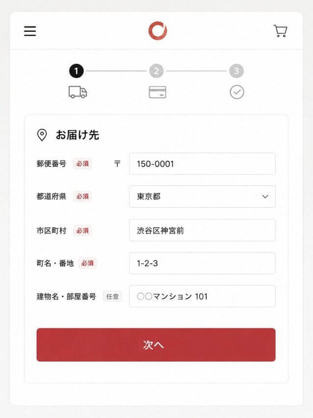
Japanese address form
If your checkout form asks for “Street Address Line 1” and “Street Address Line 2,” Japanese users have to mentally reformat their address. Many will abandon the cart rather than guess how to break their address into your fields.
Worse, many Western sites validate addresses against a US-format database that doesn’t recognize Japanese postal codes or address structures. The user enters a perfectly valid Japanese address and gets an error message saying their address is invalid.
What to do: Use a postal-code-first lookup form (the user enters their 7-digit postal code and the prefecture/city auto-populate). Display address fields in the order Japanese users expect. If your e-commerce platform doesn’t support this natively, build it with a Japan-specific address API like Yahoo Japan’s or PostalAPI.
Trap 5: Currency formatting that screams “foreign”
Japanese yen has no decimal places. ¥1,000 is one thousand yen. Showing ¥1,000.00 immediately marks your site as foreign-built and not adapted for the local market. Beyond looking unprofessional, it can confuse users about whether your prices are accurate.
Same goes for currency placement. ¥ goes before the number in Japanese, not after. Spacing matters too — most Japanese sites write the number right against the symbol with no space.
Small details. They add up to whether the site feels Japanese or feels like a translated foreign site.
Trap 6: Colors and imagery that signal the wrong things
Color associations in Japan don’t match Western defaults:
- Red. Strongly associated with sales, urgency, and energy — but also with funerals when used on text in certain contexts. Use thoughtfully.
- White. Cleanliness, purity, but also funerals. Pure white-on-white minimal designs can feel sterile or even somber.
- Black. Formal and high-end, less negative than in some Western contexts. High-end Japanese brands lean into black aggressively.
- Pink. Wider acceptance across demographics than in the West — pink is mainstream rather than gendered.
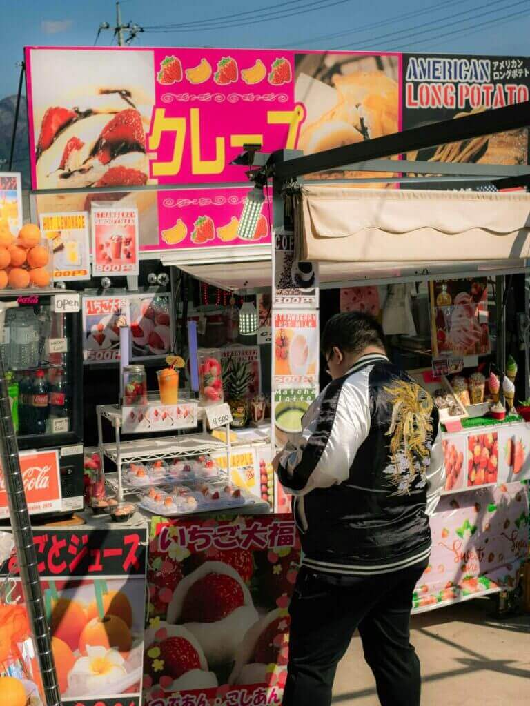
How stores in Japan use colors
Imagery matters as much as color. Stock photos of obviously Western models on a Japanese-language site signal that the brand hasn’t bothered to localize beyond the text. If you’re showing people, show people who look like your customers.
Trap 7: SEO assumptions that don’t hold in Japan
Japanese SEO operates on Google like everywhere else, but with three twists most Western marketers miss:
Yahoo Japan still matters
Yahoo Japan retains a meaningful share of Japanese search — around 20% historically, though the gap with Google has narrowed. Yahoo Japan uses Google’s algorithm under the hood but renders results differently and surfaces different content modules. Optimizing exclusively for google.com results misses a real chunk of Japanese search.
Keyword behavior differs from English markets
Japanese users tend to search with longer, more specific phrases — partially because of the way Japanese grammar works (particles, honorifics, context-dependent meaning), partially because of the keyboard input experience. The single-word query patterns common in English are less common in Japanese.
This means your keyword research from English markets doesn’t translate. “Translation software” in English maps to multiple Japanese phrases, each with different volumes and intents. Use Japanese keyword tools (Ahrefs Japan, Keywordmap) rather than translating English keyword lists.
Local backlinks carry more weight
A backlink from a Japanese site signals local relevance to Google’s Japan-localized algorithm. Without local backlinks, even well-translated content can struggle to rank against domestic competitors. Plan for outreach, partnerships, and local PR — not just content production.
Trap 8: Customer service expectations
Japanese customer service expectations are higher than nearly any other market. “Higher” doesn’t mean a faster response — it means thoroughness, formality, and follow-through that Western support teams often find excessive.
Specific things Japanese customers expect:
- A phone number. Email-only support reads as a brand that doesn’t take customer service seriously.
- A local business address (real, not a virtual office) on every page footer.
- Responses within business hours, written in proper polite-formal Japanese, with apologies for any inconvenience caused.
- A customer service section that lists hours, holidays, and contact methods explicitly.
Skipping these doesn’t just reduce conversions — it actively damages the trust your translated content was supposed to build. Japanese consumers screen for these signals before adding to cart. If they’re missing, the rest of your work is wasted.
How to actually launch in Japan
Here’s the order I’d recommend, based on what works versus what teams tend to do:
| Phase | Focus | What to do |
|---|---|---|
| Weeks 1–4 | Foundation | Translate site with native review, fix address forms and currency formatting, set up hreflang, register company information for trust signals. |
| Weeks 5–8 | Trust & payment | Add konbini, bank transfer, and JCB. Add a Japanese phone number (forwarded if needed). Get a registered Japanese business address. Add company info to footer. |
| Weeks 9–12 | Visual & content | Rebuild hero sections for Japanese visual density. Replace Western stock imagery. Hire a Japanese copywriter to rewrite (not retranslate) top 10 pages. |
| Weeks 13–24 | Acquisition | Japan-specific keyword research, local backlink outreach, optimize for Yahoo Japan, set up Google Search Console for Japan targeting. |
This is a six-month minimum to do properly. Brands that try to compress it into 30 days launch, see the numbers, and conclude “Japan is hard.” The market isn’t hard. The shortcut path you took to get there was wrong.
The bigger lesson
Every market has a layer of cultural assumptions that translation alone won’t solve. Japan happens to be the market where this is most visible to Western teams, because the gap is so wide and the failure modes are so quiet. Customers don’t complain; they just don’t come back.
Germany has its own layer (legal trust signals, consumer protection language, formality norms). South Korea has a different one (mobile-first design defaults, payment integration with KakaoPay). Brazil has another (regional Portuguese variation, payment via Boleto, WhatsApp as a primary support channel).
The mistake is treating localization as the act of swapping language. Real localization is the act of rebuilding the buying experience for a different set of cultural defaults — which sometimes uses translation, but is never just translation.
If you’re committed to Japan, commit to all of it. If you’re not, save the budget for a market where you are.
About the author
Alex Buran, Founder of ConveyThis
Alex has spent the last decade building infrastructure for multilingual websites. He writes about localization, AI search, and the technical side of going global.
LinkedIn: https://www.linkedin.com/in/alexburan/
Thinking about launching in Japan? ConveyThis offers a Japanese-language plan with native-speaker review, full hreflang automation, and integration with Japan-specific payment platforms. See the Japanese language plan